Understanding the Role of Color Choices in Shaping Brand Identity
The Psychology Behind Color
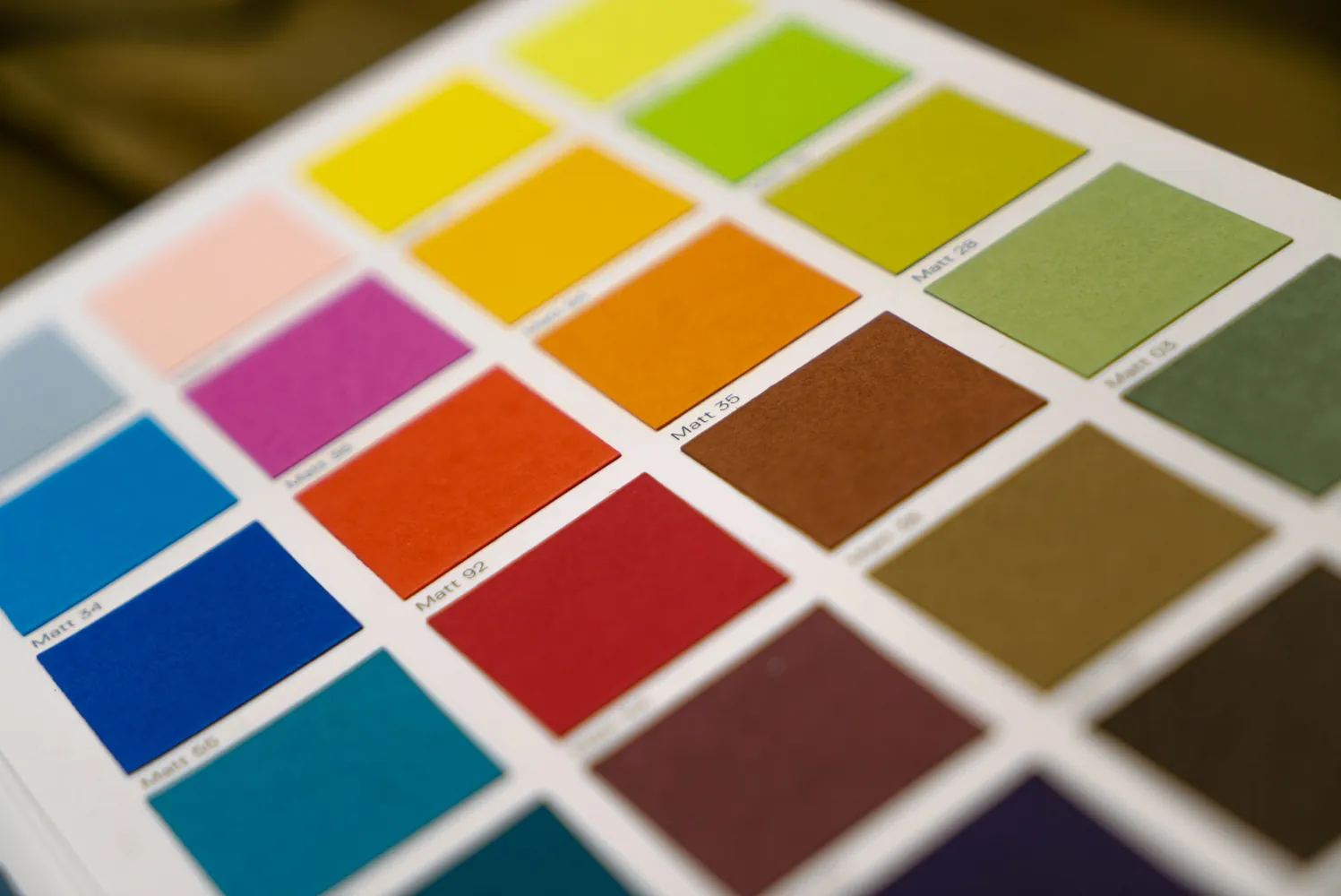
Color psychology is a fundamental aspect of branding that utilizes the human subconscious to influence perceptions and behaviors. Different colors can evoke distinct emotions and associations, which is why
For instance, red is often associated with energy, excitement, and passion. It can stimulate the appetite, which makes it a popular choice for fast-food brands. On the other hand, blue conveys trust, calmness, and professionalism, which is why it’s commonly used in corporate environments and healthcare.
Psychological Associations of Popular Colors
- Red: Passionate, energetic, urgent.
- Blue: Trustworthy, calming, secure.
- Green: Growth, health, freshness.
- Yellow: Optimism, cheerfulness, warmth.
- Purple: Luxury, creativity, wisdom.
Understanding these psychological triggers can help brands select colors that align with their core values and resonate with their target audience.
Ensuring Harmony in Color Schemes
A harmonious color scheme not only captures attention but also ensures that all elements of the brand are cohesive. This can be achieved through several approaches:
Monochromatic Color Schemes
A monochromatic color scheme uses various shades and tints of a single color. This approach is effective in creating a sleek and polished look. It's ideal for brands looking to maintain simplicity and elegance without overwhelming visual complexity.
Pros: Simplicity, unity, and focus.
Cons: Limited visual interest if not executed well.
Complementary Color Schemes
This scheme involves using colors opposite each other on the color wheel. The high contrast creates a vibrant look that can add energy to the brand's visuals. This is particularly effective for brands wanting to stand out and draw immediate attention.
Pros: High visual impact, attention-grabbing.
Cons: Risk of overpowering; requires careful balance.
Analogous Color Schemes
An analogous color scheme utilizes colors next to each other on the color wheel. It provides more harmony than contrast and is suitable for brands seeking a serene and comfortable vibe.
Pros: Harmonious, visually pleasing.
Cons: Less contrast; might lack excitement if not balanced well.
User Feedback and Testing Variations
Even with a well-researched color strategy, it's crucial to test variations through user feedback. This iterative process can help brands fine-tune their color choices to better suit their audience's preferences.
A/B Testing in Branding
A/B testing allows brands to present two versions of a design with different color schemes to segments of their audience to see which performs better in terms of engagement or conversion metrics. This data-driven approach can guide final decisions.
User Surveys and Interviews
User surveys can gather qualitative feedback on emotional responses to color choices. Meanwhile, interviews can provide deeper insights into personal preferences and how these align with brand messaging.
Case Study Examples
Coca-Cola: The use of red in Coca-Cola’s branding symbolizes excitement and boldness, perfectly matching its image as an energetic and refreshing beverage.
Tiffany & Co.: The iconic Tiffany Blue communicates luxury and exclusivity, reinforcing the brand’s identity as a prestigious jewelry retailer.
These examples illustrate how strategic color choices support brand identity by aligning with consumer expectations and perceptions.
Conclusion: Crafting a Memorable Brand Identity
The choice of color in branding goes beyond aesthetics; it’s a critical part of the overall brand strategy that impacts consumer perception and loyalty. By understanding the psychological associations of colors, ensuring harmony in design, and leveraging user feedback, brands can effectively shape their identity in the minds of consumers. The key is balancing creative vision with strategic planning to create a memorable brand that resonates with its audience.